Proposed Redesign
Ovalo24 Miami
Overview
blHA BLAH
Site Components
Social Media
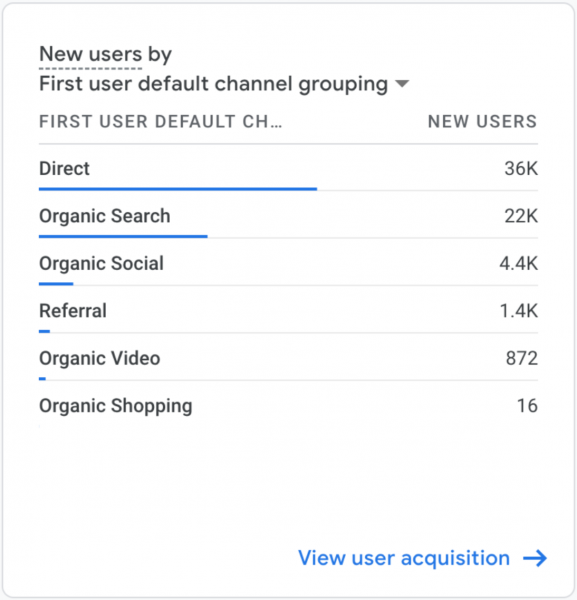
We added links to the Oval24 Miami social media profile: FB, IG, YT. In the past 12 months, more than 50% of new users came to the site directly, followed by Search and Social.
Category Breakdown
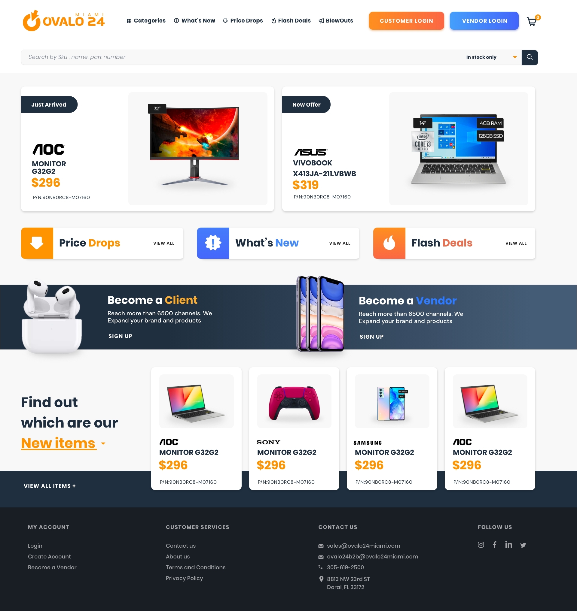
We moved the categories to the top menu to be available at all times.
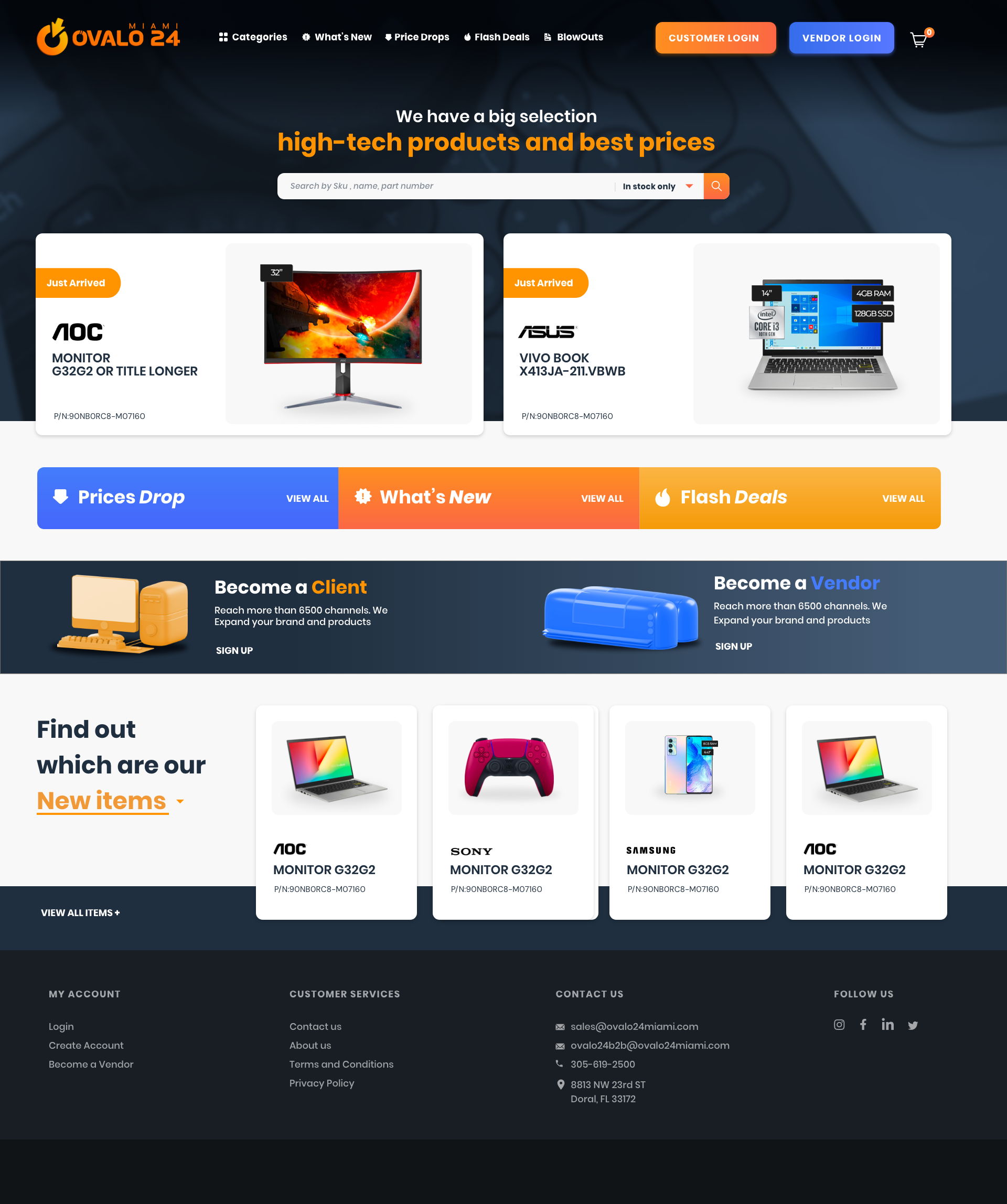
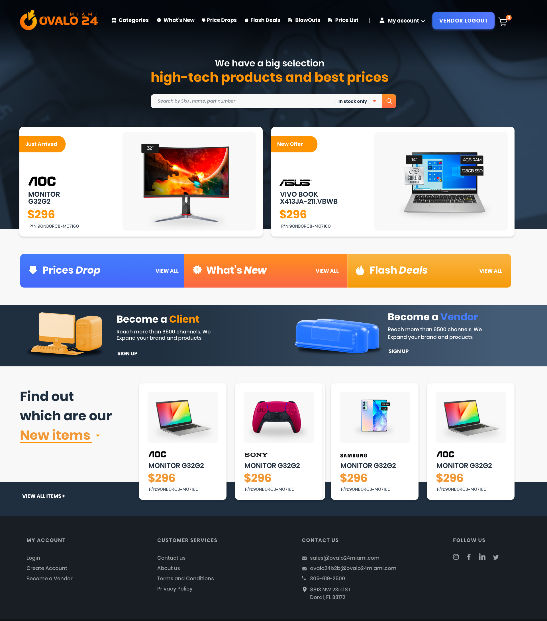
The login is prominently displayed while the registration banner is available above the fold.
The order of the 3 main items is swapped according to views in the past 12 months: price drop, new revenue, flash deals
Home
Logged Out
Logged In
Category
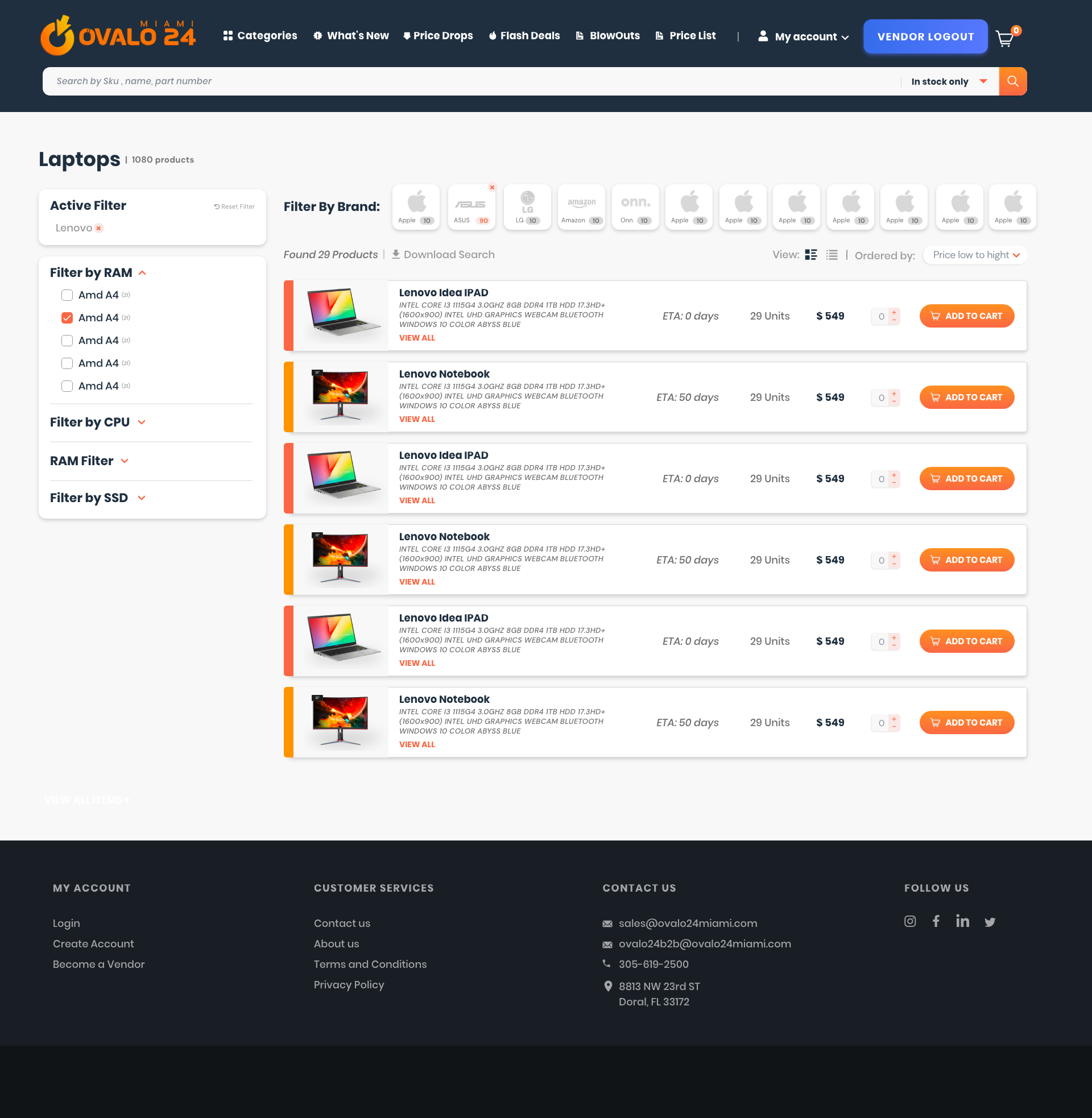
Collapsed View
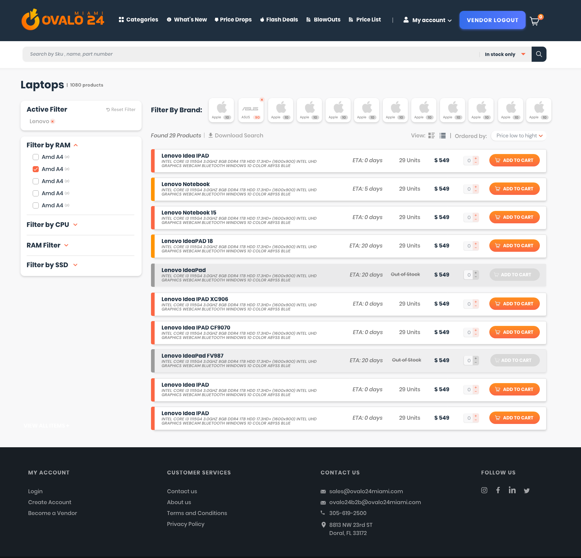
Expanded View
A Feature, Not a Bug
The site will have a hidden experience and easter eggs throughout, with surprise elements, facts and slice-of-life glimpses into #LifeatCaptura located at the click of a specific elements (like the Captura logo). It is a playful way for us to captura the user with content and insights as they navigate the site, and will reinforce the innovative and creative nature at the agency. Similarly, the letter “c” will be visually represented in animations and rollovers, a subtle reinforcement of the brand.
Copywriting
The tone and voice of the site will be informed, fun, modern and current. Captura celebrates the growing role and power of multicultural marketing, particularly as a leading agent of change in how Hispanics are perceived and marketed to by global brands. As part of this topical authority, we will intentionally include Spanish-language copy and phrasing where appropriate, but ensure it is gender neutral and inclusive, as this also reflects what Captura is about.